INTRODUCTION
Brief
Design an informative portal to interface between NTT and its clients across the globe based on NTT’s tried and trusted multi-vendor support services to ensure consistent asset availability and performance.
About Service Portal
Service Portal provides effective data-driven insights and advisories to simplify operational support and maximize the full lifecycle value of clients’ technology from the core to the edge of multi-technology infrastructure.

My Roles and Responsibilities
-
- Understand the existing experience models to identify pain points to identify experience pain points and opportunities.
- Come up with practical design solutions bearing in mind the technical constraints.
- Work independently and manage all design requirements, feedback, and approvals.
- Targeted for a unified design language and experiences across NTT’s products and service offerings.
The Task
Design a unified portal experience and provide data-driven insights and recommendations to serve as a ‘single pane of glass’ for a few of the key service offerings from NTT.
The challenges
-
- Incorporating data from 3-4 different services into one single portal.
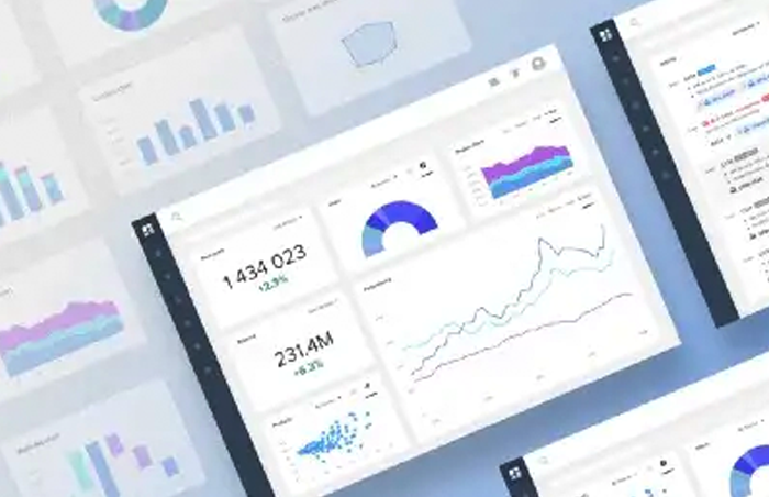
- Building informative dashboards to present complex and dynamic data in a way that can be easily searched analyzed and exported.
- Making a data-heavy interface visually appealing.
Project Constraints
Technical: The key requirement of the project was to find a very key balance between the right amount and right type of data to be presented on the dashboard available from different streams, most of the backend of those system were not flexible enough and had very limited functionality. In some cases smarter or more user friendly functionalities were not feasible.
Almost zero user data and product references: Very limited user insights and information was available as there was no mechanism in place to understand the user behaviour, usage pattern of the portal and barrier in communication between product development team and client facing teams.
Also being a subscription-based model, competitive products could not be viewed or referenced for benchmarking the design.
RESEARCH
Stakeholders Interview Questionnaire
Technology Infrastructure services was a new and unfamiliar business for me. Therefore I drafted the stakeholder’s interview questionnaire to understand What data points are needed ?, How are they being prioritized? What features are essential for the portal? How the portal would help our customer to achieve their business goal? Who are the targeted user groups? to make the portal informative and actionable.
User Persona and User Journey
As we didn’t have direct access to the actual user of the product, we created a few detailed personas that represent the target audience and their characteristics with the help of Subject matter experts and Industry Experts.
Online Study
I invested a significant amount of time in few online blogs and seminar on Dashboard Design & Designing Portal Experiences as I wanted to base my design decision on both User Insights (obtained from SMEs and Industry Experts) as well as principles and references.
10 Rules of Better Dashboard Design
Effective dashboard design

Dashboard Design Best Practices
PROBLEM SOLVING
Solving Challenge 1
Consolidation and presentation of all the relevant services under a single menu.
Solution
The new Services Portal Global menu is designed to group items logically under clear and concise terms. It is designed to work towards a single Portal where service-specific apps and services are included within the portal. The menu is shown in the order that users have been shown to use the Portal i.e. Support is first. A global app will usually consist of several ‘supporting’ apps that will be accessed via a side menu.
We logically grouped the functionalities. We envisioned that user homepages will be tailored so that all information they require will be shown and accessed here and that the natural flow of the UX journey will allow them to find what they are looking for without having to deep dive into multiple vague menus.

PROBLEM SOLVING
Solving Challenge 2
Prioritizing content – What are the most important data-points the user needs in specific services?
Solution
Designed landing pages for individual apps for each of the service specific pages (Apps) with the right matrices (data-points) prioritised in right order for the user to be well informed about the state of the services and to take suitable actions.

The Tickets overview page is designed to show the user a snapshot of their most useful tickets
Overview widgets
Overview widgets that present a view of the user’s tickets but also act as filters when the user clicks a metric. The user is taken to the filtered list view. These Overview widgets can be configured to show different views via quick filters on the widget – or via a widget configuration modal.
Ticket list widgets
Under the Overview widgets are our standard ticket list widgets ( these are the same widgets that are found on the homepage – however, they will be configured to show different information – these views will be set via onboarding but are configurable at the customer or user level )

The CI app gives the user a unified view of all their CIs across all their services via the Digital Fabric.
CI Overview
The overview page shows a snapshot of the user’s CIs in the Services Portal. The widgets allow users to ‘pre-filter’ the list page where they can drill down to a specific CI. The overview widgets are highly configurable to show different user-customizable views via quick filters on the widgets or via a widget configuration modal.
PROBLEM SOLVING
Solving Challenge 3
Designing the data tables for a better view, search, filtering, and export. (Complexity to simplicity)
The data tables used in the applications consisted of thousands of data points. Therefore, the table required to present 15-25 columns, This was causing a data overload and the viewport was not enough to get the essential data in the first place itself.
The “Search/Filter” function was also a very crucial feature in the portal where there were around 10-13 filters with different combinations to get the desired search result. Below is a sample search query for ref.
I want to see tickets which are marked as Completed for P-1 Tickets which were raised between 10th Nov – 12th Nov and created by Robert Pieterson for Network Devices present in Bangalore Location.
Solution
Designed a List View Page which is Highly filterable and configurable – it offers the users the ability to quickly drill down and find a particular list item’s details. The user can visit this page from the link in the in-app navigation or, more likely, be brought here by a link external to the app – in this case they are likely to be shown a pre-filtered page with information pertinent to where they came from ( e.g. there might be a widget on a service-specific overview page which shows the total number of CIs/Tickets for that one service – this widget will link to the CI list / Ticket List page with a filter set for that one service )

Ticket list page with search, filter export, and configuration option to customize the column

CI list page with search, filter export, and configuration option to customize the column
Table Configuration
The user can modify which columns appear in the table of the list view. They can rename, reorder and make the data into a link. Once a new column is added to the table – the filter option is updated to allow the user to filter on that column.
Both column settings and table appearance are persistent. When the user refreshes or leaves the app and returns, or when they logout/login back in the table will keep these settings ( options also exist to allow the defaults to be restored )


Search Function
User clicks the search button, types in keywords, hits enter, chip is added and the underlying data shown searched by keywords

Filter Option
Filters are configured to the data that is being filtered. The filters are ‘wizard’ based where the user is led in a series of steps to create the desired filter. There are also a number of preset ‘quick filters’ that allow for one-touch filtering ( used mostly – at the moment – for dates ‘Created in the last 7 days, etc.
Complex filters can be setup. A qualifier can be appended i.e. contains / is empty / is not empty / does not contain etc. Pre defined / user saved quick filters can also be added like ‘updated in last 30days’ or ‘Has performance data’.


PROBLEM SOLVING
Solving Challenge 4
Designing a consistent but highly configurable user interface for a unified portal experience for all the services (interested service divisions)
Solution
To achieve the unified portal experience (cross-functional), we did a workshop with other service divisions to understand their existing dashboards and requirements. The outcome of the said workshop was.
- We were able to define a Core Architecture to include the required services.
- Structured a plan to showcase most valuable insights/informations of all the services in a common home page.
- Packaged all the relevant information/data of a single service offerings as Apps.
- Defined Modular Widget Structures / Components, customisable enough to accommodate different data, charts, and views inside Service Specific (Apps) pages.
- Set out some overriding Rules and Guidelines that need to be followed to develop Service Specific (Apps) pages and its Widgets.
- Defined rules to Reuse and Share Widgets/Components across different service specific (Apps) Pages.

Service Portal Core Architecture

Common Portal Home Page

Service Specific Page (App) Overview

Sample Configurable widgets library shared by all Apps (service specific / common)
PROBLEM SOLVING
Solving Challenge 5
Making a data-heavy interface visually appealing & Implementing one design language across the portal.
Solution
Aesthetic appeal = simplicity
The whole idea of this unified dashboard was to represent data in a very consumable format and the right visual design was one of the key factors for the portal adaptation.
Consumer Reports found that users will decide whether to trust the credibility of a site based more on its visual cues than its actual content.
So in order to achieve a consistent and appealing visual design we defined a set of colors and visual design elements and used it consistently across all the portal pages. The primary colors were derived from NTT Brand Portal but the secondary colors were selected based on the contrast ratio between the graphics and page background for both light and dark themes.
We also defined a set of interaction patterns for Buttons, widgets, Icons, Links, poppers, dropdowns, etc to make the interaction uniform across the portal.
The Visual Design elements were developed as libraries in the prototyping tool to be shared with different teams to maintain uniformity
PROBLEM SOLVING
Solving Challenge 6
Option to quickly look into all possible information across different services about a specific item.
Solution
Don’t give depth without breadth
Provided an option to perform a global search where the user enters their search term to search the entire portal globally to find the information they need.
Designed a global search to crawl the entire portal, where the users won’t just get search results from one portal section, they’ll get them from multiple ones. This allows users to discover other relevant information in other portal sections that they would have found by going into multiple section of the portals
Users not only get the depth but the breadth of their searches as well.

Accessed from the spyglass search icon in the utility bar. A search input opens where the user can type in a few keywords to search upon.

Search results are presented in a list form under tabs. Depending upon the services the user has access to these tabs will vary.

Currently, the advanced search is basic. Planned enhancements include time ranges/regex etc.
PROBLEM SOLVING
Solving Challenge 7
Inconsistent Data representations.
Solution
Some of the data columns such as tickets details CI details, and location details, affected assets were inconsistent.
- The No. Affected assets, locations, and tickets for CIs could vary from 1 to many.

Added tooltips where it was applicable to show more information.
The widgets also had some inconsistencies. There was a possibility that widgets will have no information, so instead of hiding the section altogether, I suggested including a note saying “No Data” & “Connection Error”. Not showing any data may lead to ambiguity; the user may feel the page has an error or the information is not available.
DESIGN PROCESS
Working with a multi-disciplinary team.
What was different?
With previous projects, I was very used to working with single teams with multiple team members, but in this project, things were quite different.
- Design approvals and technical validations were not quick as multiple teams and stakeholders were involved in the project.
- Fitting every service requirement in one framework was extremely difficult as there were unique challenges wrt services that needed to be solved.
- Quick low fidelity wireframes and sketches worked really to convey the design ideas to the stakeholders.
- The product dev team was quick enough to analyze the design and provide feedback
As time went by, i got more familiar with the system and the way it was operating.
TAKEAWAYS
Every project is unique
- Rapid prototypes are always useful to convey the intended design decision.
- When you want to convince a thousand people, then first bring them under one roof (in this case the design workshop with different service offering teams was really helpful).
- Importance of technical validations during visual design.
- Would have preferred to test the portal with potential users before going live.
PORTAL IN ACTION
TESTIMONIALS

Eugene Mityashev
Abhilash has joined our Service Design team and created the impact the very first week of his employment. NTT's services are complex and technologies they deal with are too, which makes UX designer's work a particularly challenging one. Abhilash managed to land on his feet, grasped new concepts very fast and started translating them into intuitive and visually appealing designs. Abhilash has a deep understanding of user-centric design approaches and technics and is also skilled in using a variety of design tools.
It has been a pleasure working with Abhilash, I highly recommend him for any UX design role. His enthusiasm and dedication to his profession make him an asset to any team.
